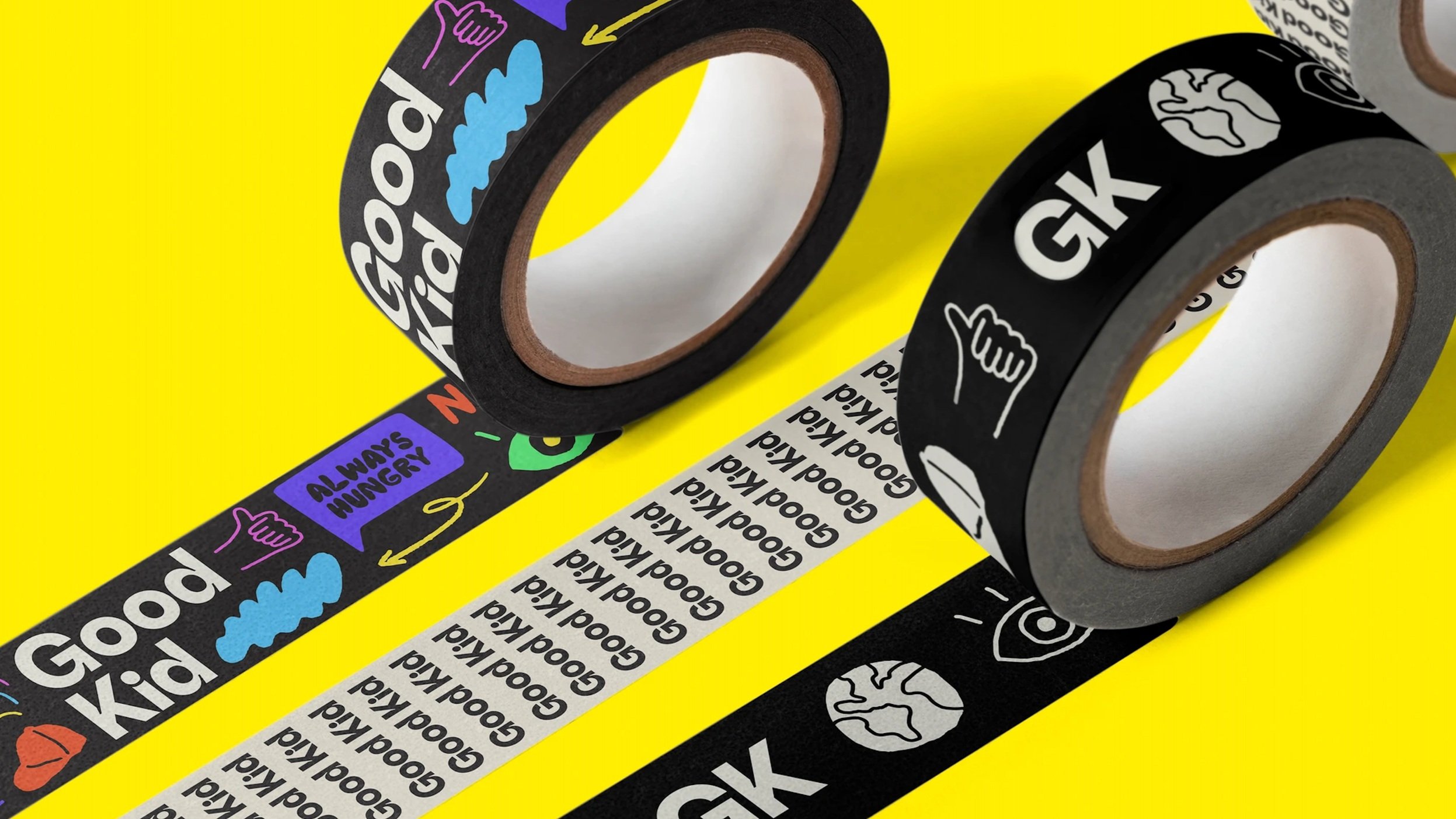
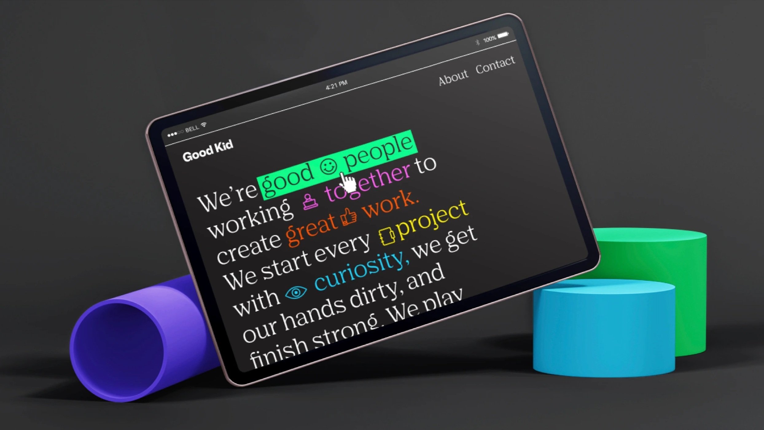
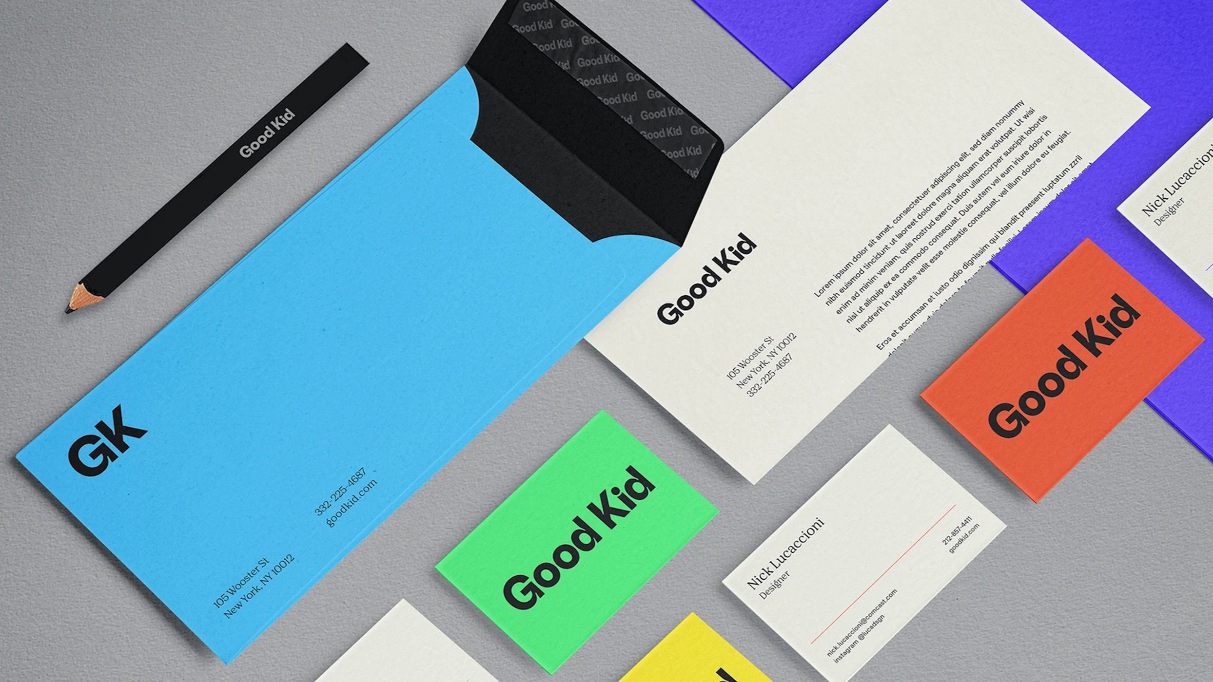
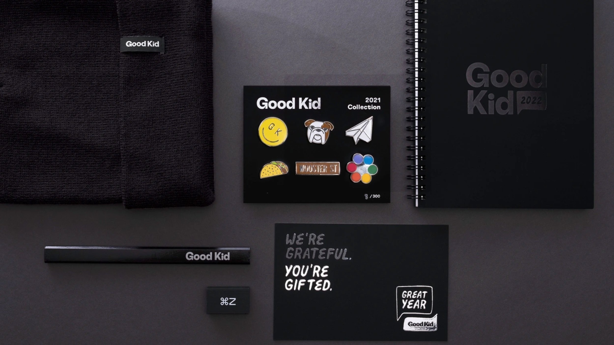
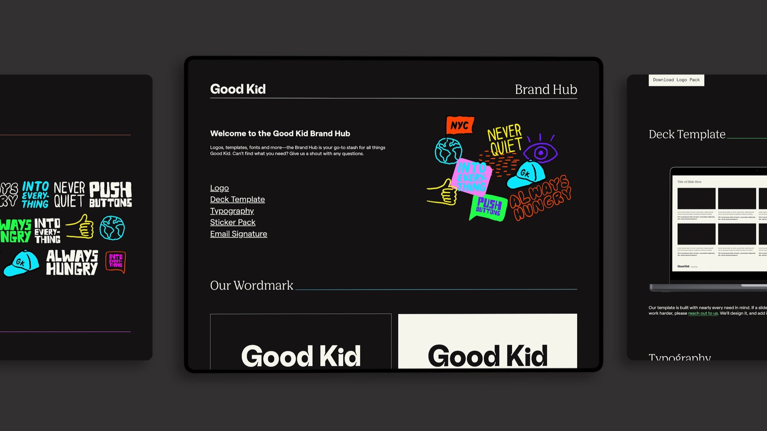
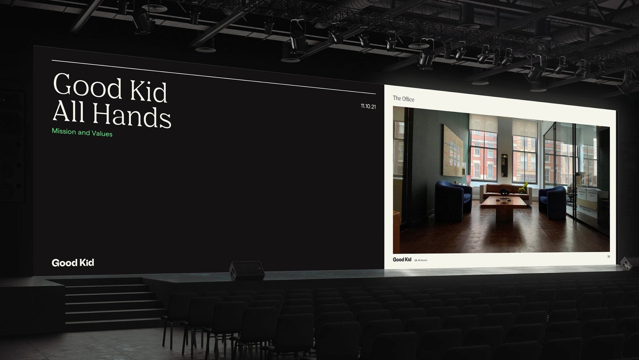
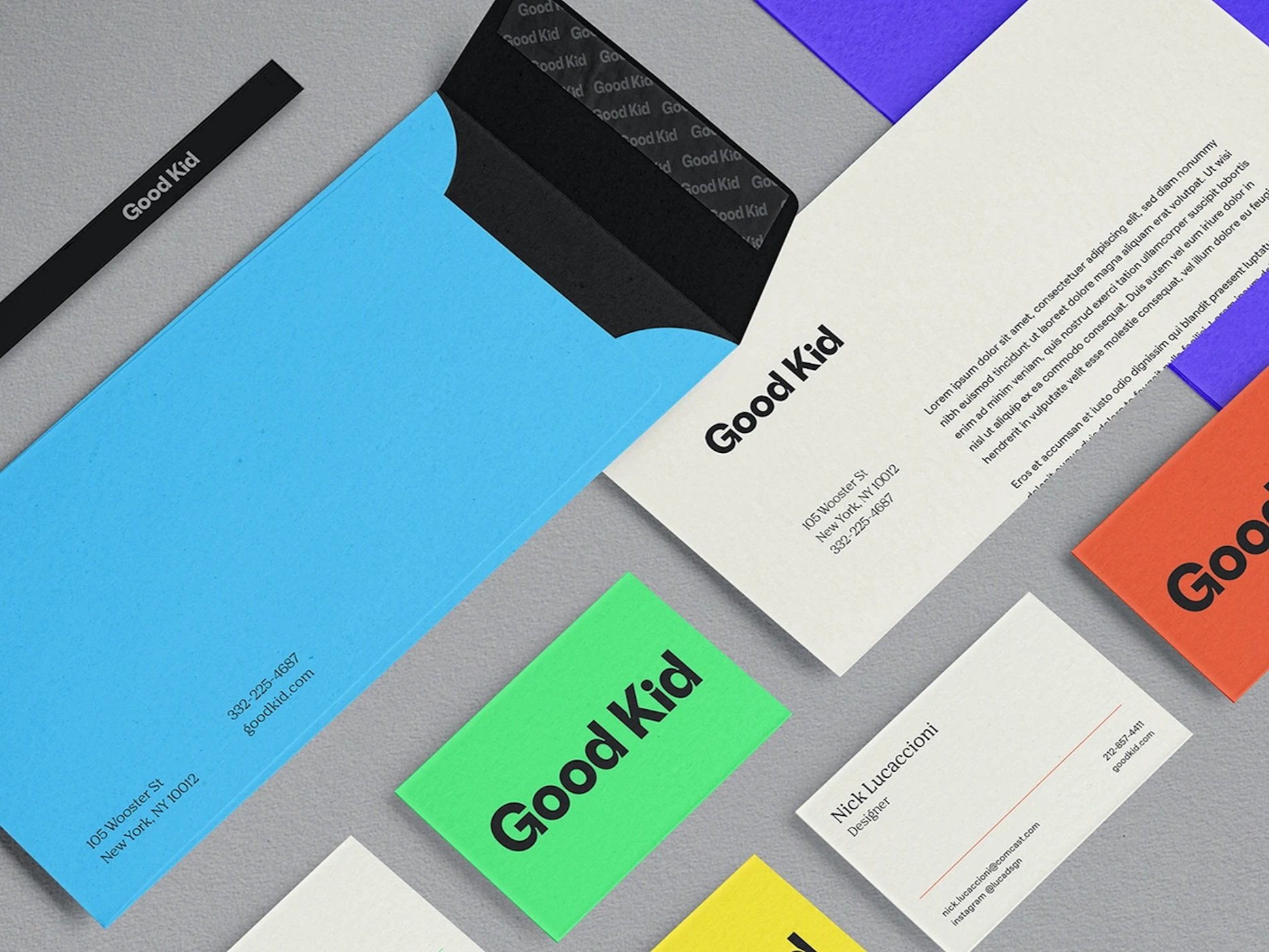
Art Direction + Brand Identity
In 2021 had an opportunity to be part of the design team at Good Kid, Comcast's In-House Agency. The initial project was to create a new identity for the stand-alone agency, one that wasn't dependent on the Comcast system.
We started by taking the peacock rainbow colors and then brightened them for a fresh new approach that was rooted in the parent company.
We developed an implemented branding across every internal and external touchpoint including website, social, brand hub, offices, email design system, sticker packs, presentation templates, stationary, and naturally plenty of merch.
Studio: Good Kid in-house
Design Director, Head of Design: Amanda Assadi
Associate Design Director: Sean Callen
Art Directors: John Knoerl, Nick Luccacioni, Filiz Sahin
Illustration: John Knoerl
Typefaces: GT Flexa Grilli Type, Nib Pro Colophon, Matter Displaay
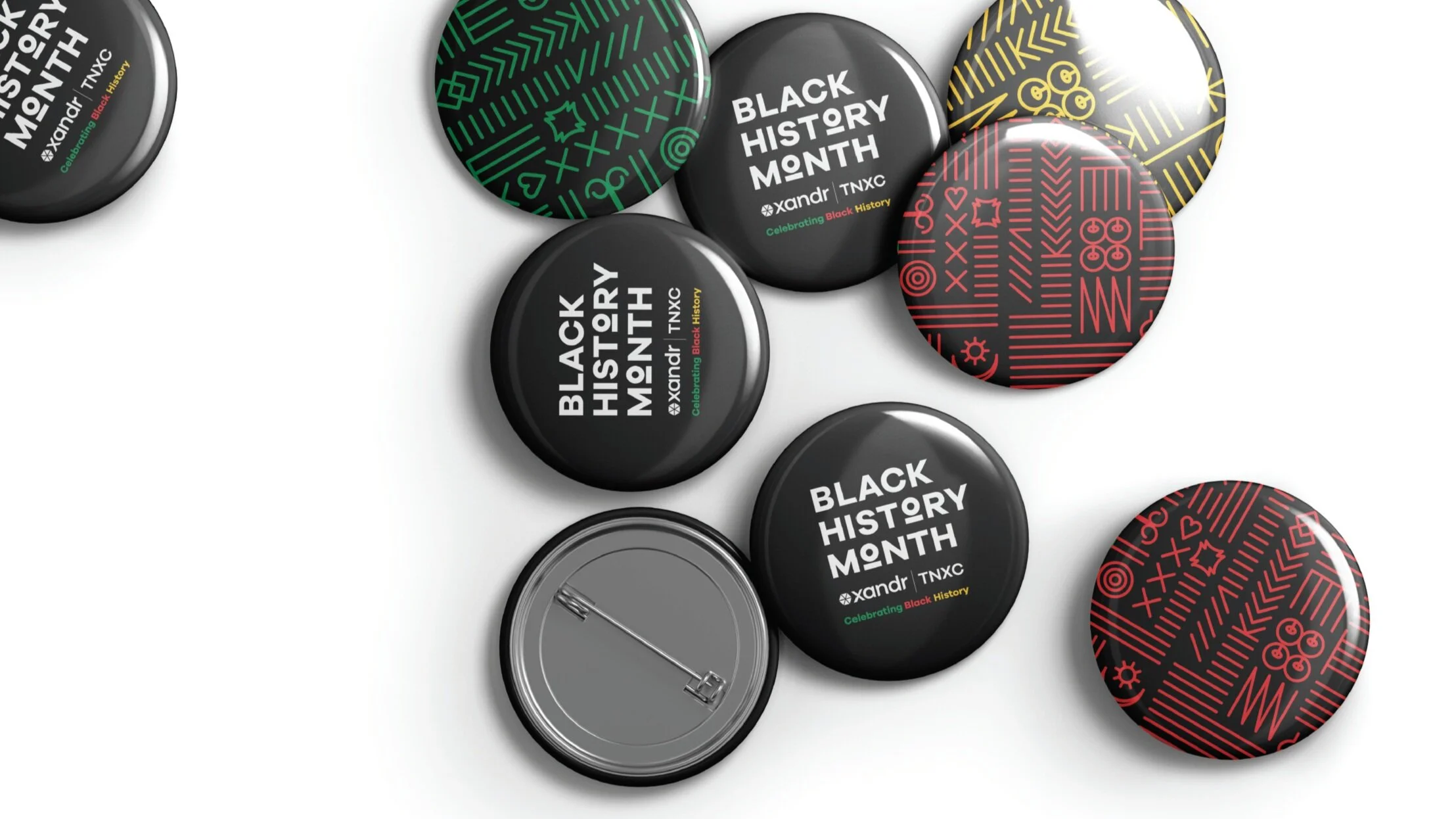
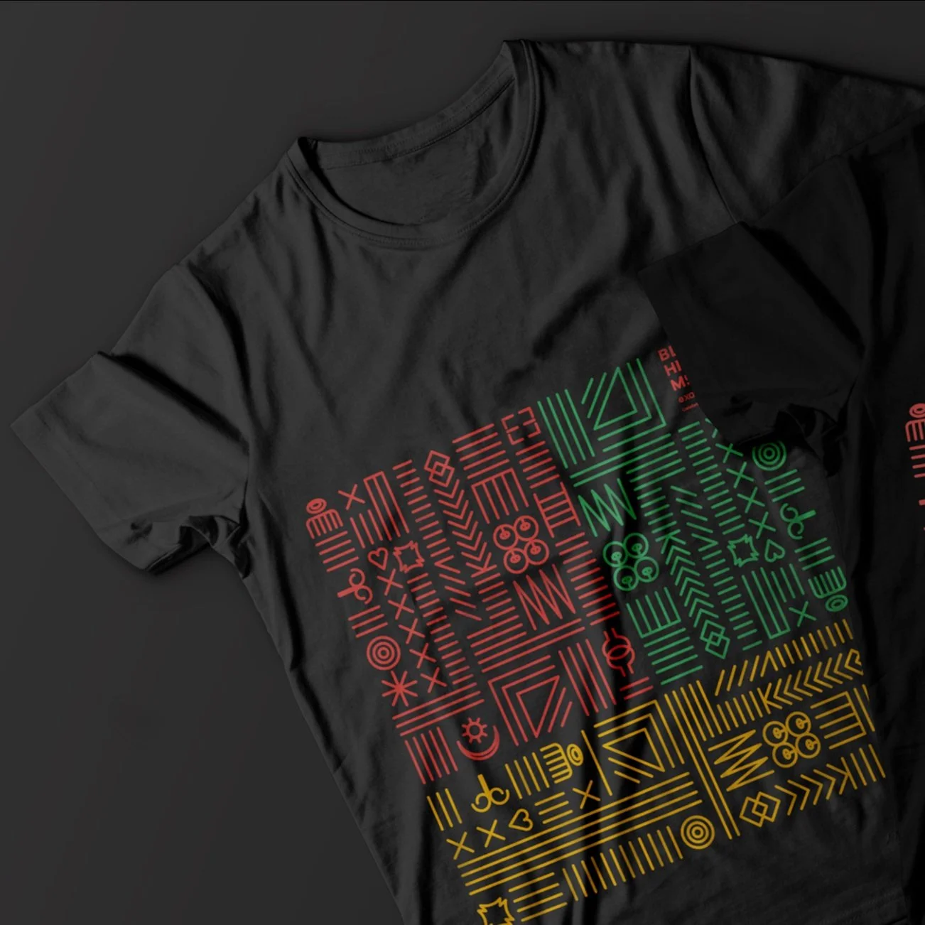
Black History Month
Branding + Art Direction + Print Materials + Animation
It's a honor Black history and the contributions and sacrifices of the African American community that have and continue to shape our country. Design a social and print materials to celebrate chain of events during this month.
Client: Xandr
Art Direction + Brand Identity + Digital and Print Materials + Animation
At Metropolitan Montessori School the child is at the center of their work and the guiding light to our purpose. Its motto, An Education for Life, aptly articulates these values and serves as a perfect framework for original identity: the use of letter forms in a triangle that emphasize the dynamic partnership of child, adult, and environment. Front and center of any brand communication is the fact that Metropolitan Montessori School is a place where diversity is valued, where everyone can succeed, and where passion and connection come first.
https://www.mmsny.org/
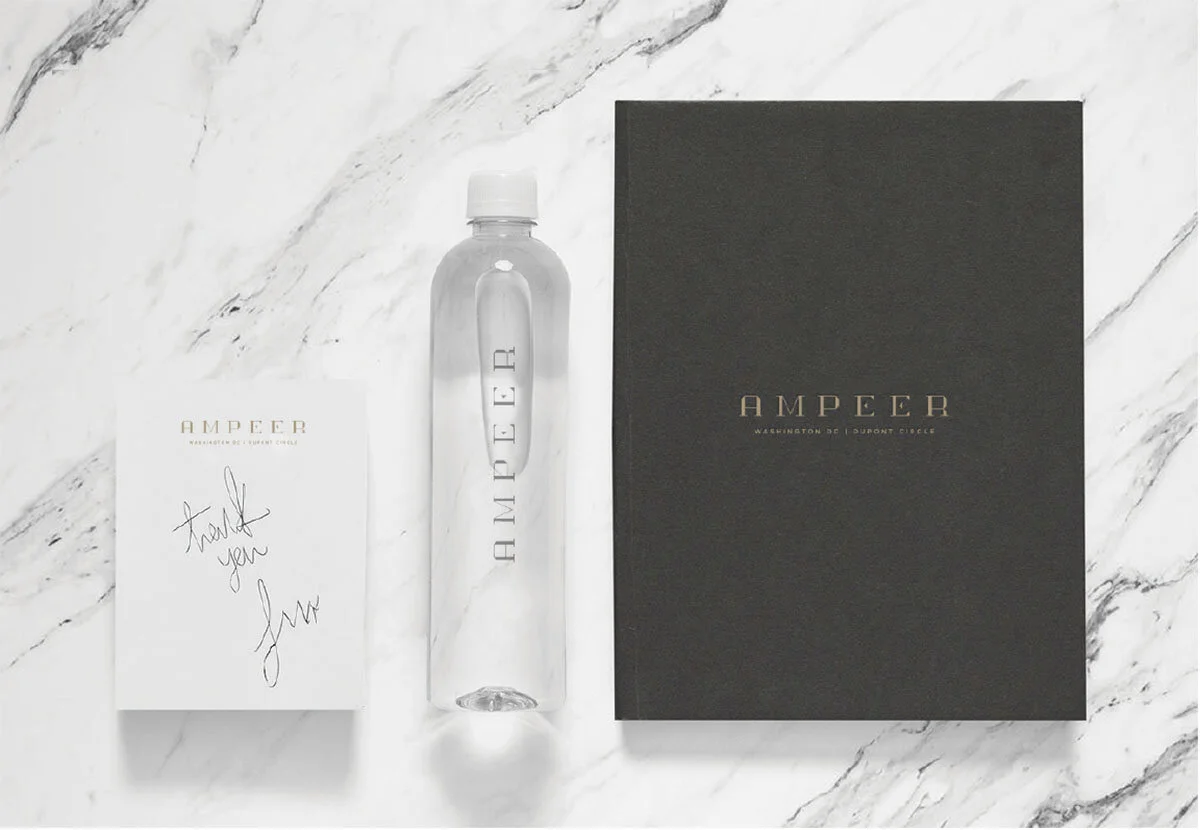
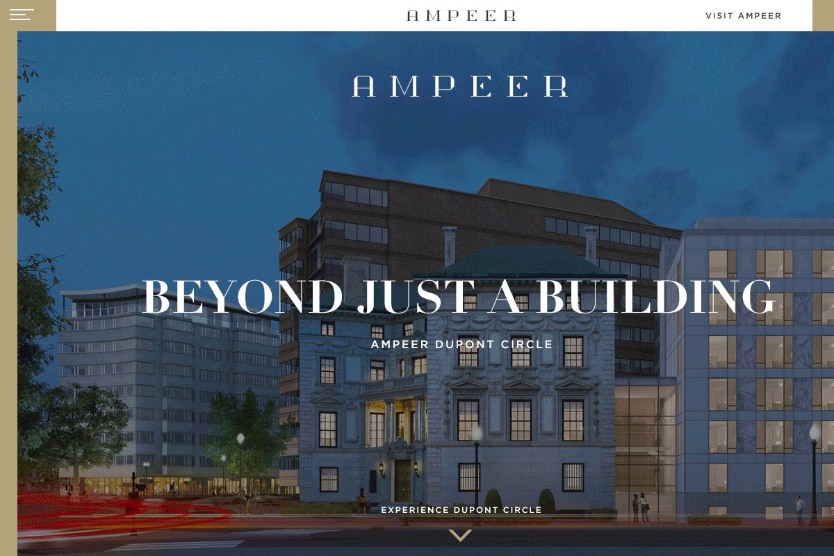
Art Direction + Brand Identity & Custom Typeface + Print and Digital Materials
Ampeer combines the comforts of a condominium with the ease of a short-term lease and the intimacy of a private social club. Created a custom Ampeer type-face and applied it to signage, collateral, and merchandise.
Horizon Interactive Award Gold winner for Real Estate websites
Named Webby Award honoree in the Websites: Real Estate category
Agency: REQ
Client: Saul Urban
Art Direction + Brand Identity & Custom Typeface + Package Design
The RASA brandmark was designed to reflect the lively personality and colorful food of RASA. The brand breaks free from traditional perceptions of Indian food in American culture with a brand that highlights their innovative, playful, and flavorful approach to Indian cuisine. RASA, celebrate this connection by sharing authentic flavors and mindfully sourced meals.
Agency: REQ
Client: RASA
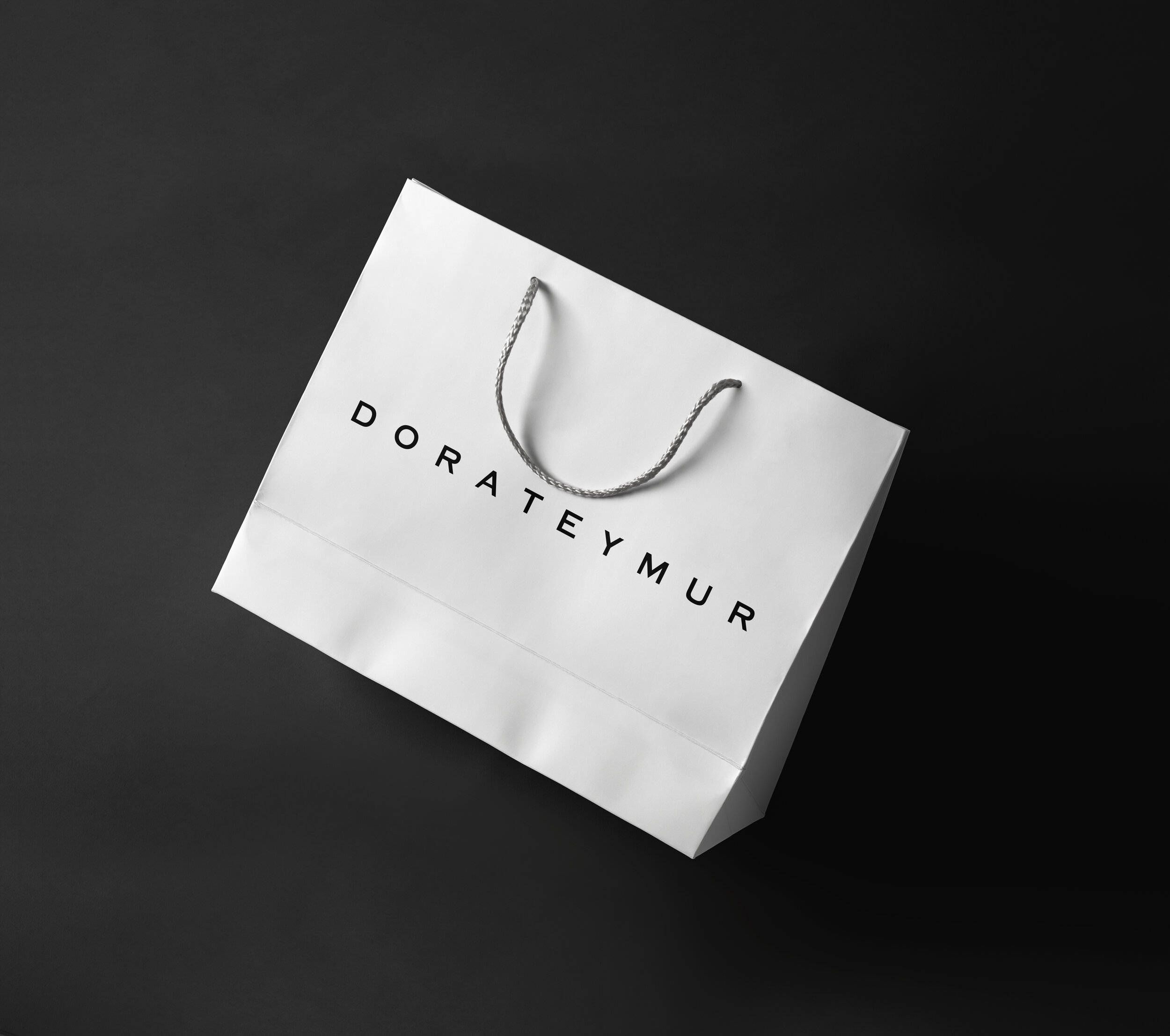
Art Direction + Brand Identity + Package Design
Femininity with a bite and a dash of masculinity - that’s the duality of genres that can characterize the London-based brand’s aesthetics. Founded by the Turkish designer Dora Teymur in 2012, the brand represents the nostalgic aesthetic of the past century with the modern touch. Branding needs to focus on retro design and contemporary touch final result timeless design.
dorateymur.com
Art Direction + Branding Identity + Packaging Design
Endorfia Chocolatier is luxury brand manufacturer of chocolates and related products. Everyday assortments and signature assortments offer a variety of flavors. Endorfia assortments include gift boxes, and samplers, or you could order a chocolate of the month collection for a gift that lasts. And that’s just the beginning sets of this chocolate serenade.
Client: Endorfia
Art Direction + Branding + Packaging + Print Collateral
Towel.com is a Turkish Towel company with thoughtfully designed products with the vision of providing consumers with bath collections that offer casual, affordable luxury. Meticulous craftsmanship. The finest Turkish cotton.
My design approach brings out the artisanal origins of the product, while reflects a classic sensation, through a custom serif for the brand and a symbol that references a Turkish cotton bud.
Client: Towel.com
Branding + Art Direction + Print Materials + Custom Typeface
The task was create a branding with a unique and modern typeface. I usually create custom fonts through referencing existing fonts by modifying them in order to meet the client’s needs. This time the process was different.
Galaxi Gala Type was started from hand sketches. I first created the letters L, J, U and R and the rest followed. At the end we were happy with the result. I tried to combine an unusual modern typeface with a vibrant, dramatic color palette. The client loved the new logo made by an extraordinary new font face logotype with custom type face. Identity is based on stylized font and vibrant color palettes.